The real problem
Users were failing — and we knew why.
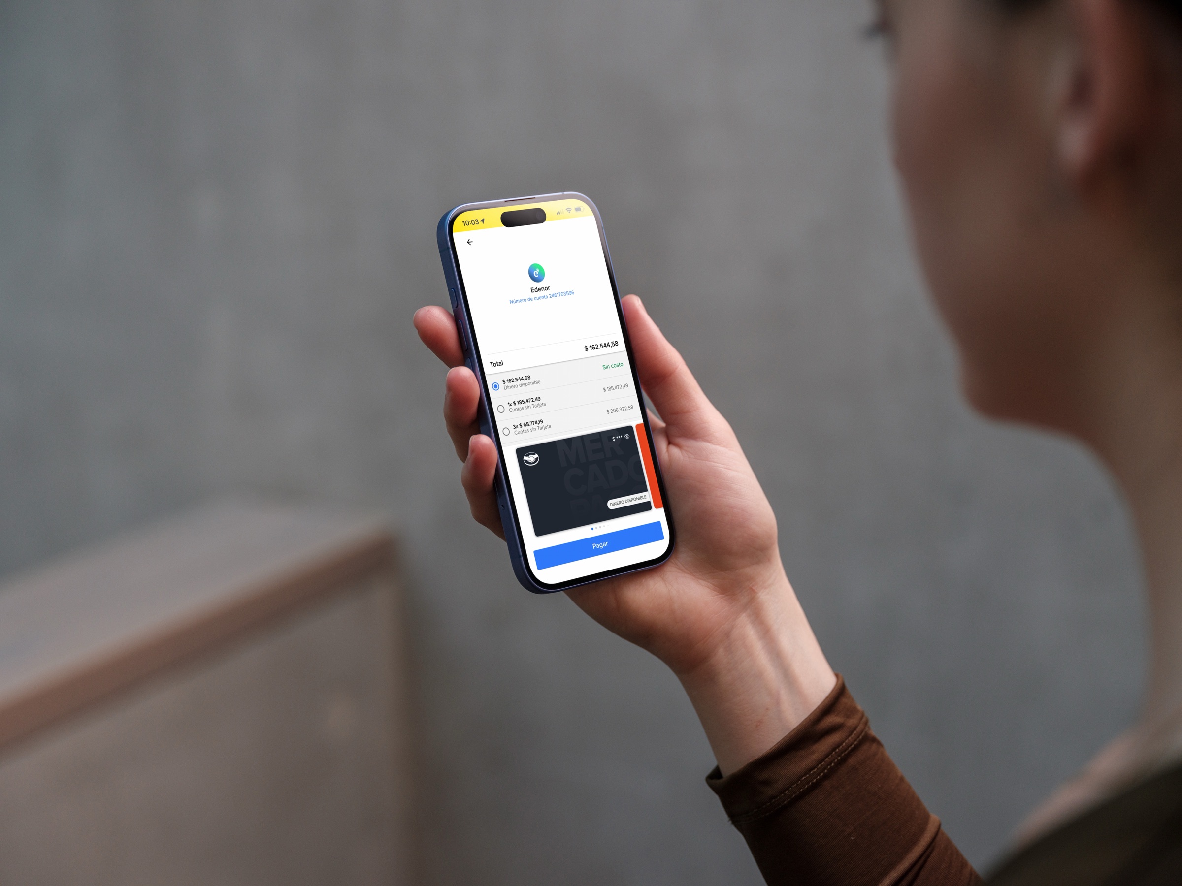
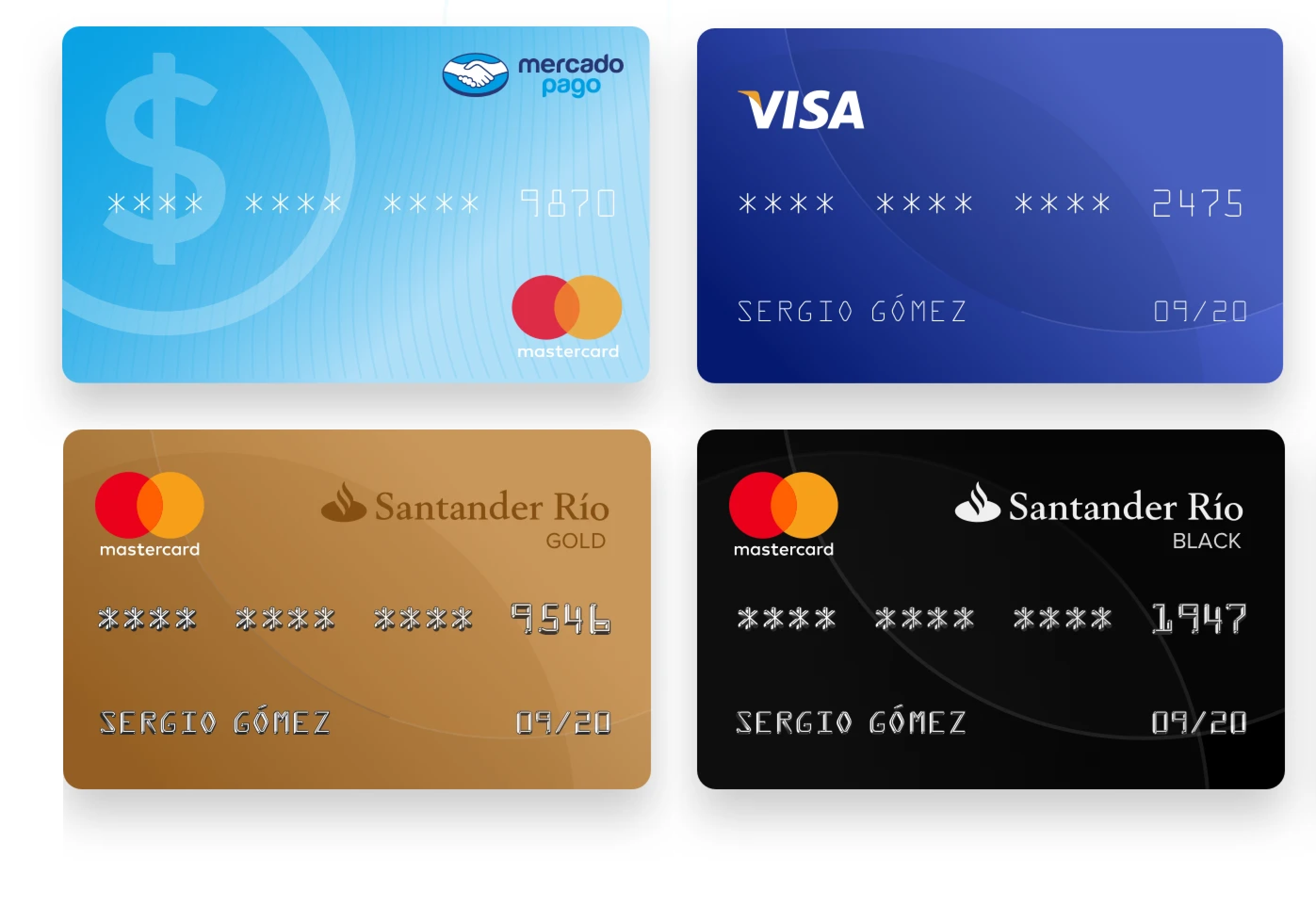
Users frequently struggled to quickly identify and select the correct payment method, especially when several cards were saved. The screen looked uniform: cards differentiated by little more than color tokens and a network logo.
- Low visual differentiation between cards.
- High cognitive load during a high-pressure decision.
- Frequent selection errors.
- Rising support contacts and negative post-purchase experiences.
From a business perspective, errors at this stage directly impacted conversion, trust and cost (support + refunds). The issue wasn't layout. It was recognizability.
 Previous cards
Users don't read payment options — they scan and recognize.
Before & after
Two checkouts, twelve months apart.
Nearly identical cards became distinct, recognizable payment methods — aligned with how users identify them in the real world.
Beyond the visual skinning of the cards, the entire screen was refactored to prioritize information density over white space. We tightened the grid to ensure that critical metadata — such as card issuer, balance status and credit terms — occupy a single visual plane, creating a more efficient and confident checkout experience.

The hard decision
Long-term trust over short-term credit metrics.
One of the biggest problems was the confusion between "available balance" and "Mercado Crédito" when shown as separate options. Users were frequently selecting Mercado Crédito unintentionally, expecting to pay with available balance and feeling incorrectly charged.
Unifying both options reduced accidental credit usage — but risked lowering short-term credit volume.
The decision wasn't visual. It was strategic.
We prioritized user clarity and long-term trust, aligning with stakeholders around a deliberate trade-off: accept a short-term metric impact to strengthen product trust over time.
The right metric was never "credit selected today." It was "users who trust this product tomorrow."
Impact
A more reliable checkout, at scale.
The component scaled across checkout, wallet and card management — becoming the reusable pattern for payment selection across Mercado Pago.
The redesign showed that faster decisions come from recognition, not additional explanation.