Redesigning Flow’s home to help people choose what to watch
A proposal for the mobile TV and streaming app that organizes featured content around three situations: resume, reach a live event or discover something to watch.
ContextDesign challenge for a hiring process.
ChallengeTurn visits into viewing by encouraging people to stay, helping them discover content and motivating them to press play.
My roleDiagnosis, prioritization rule and prototype.
The home doesn’t have a content problem. It has a problem of order.
The brief described people browsing and leaving without watching. My diagnosis: the home is designed as a catalog. And a catalog is deliberately even. A catalog optimizes for completeness; a home that aims to turn visits into viewing has a different job: helping people decide what to play.
From the brief
I open Flow knowing I want to watch something, but I never know what. I end up scrolling for a while and closing it without watching anything.
Lucía, 28
The app has a lot of content, but it doesn’t show it in a way that catches my attention. Everything looks the same.
Marcos, 35
Analysis · Current Flow mobile screens
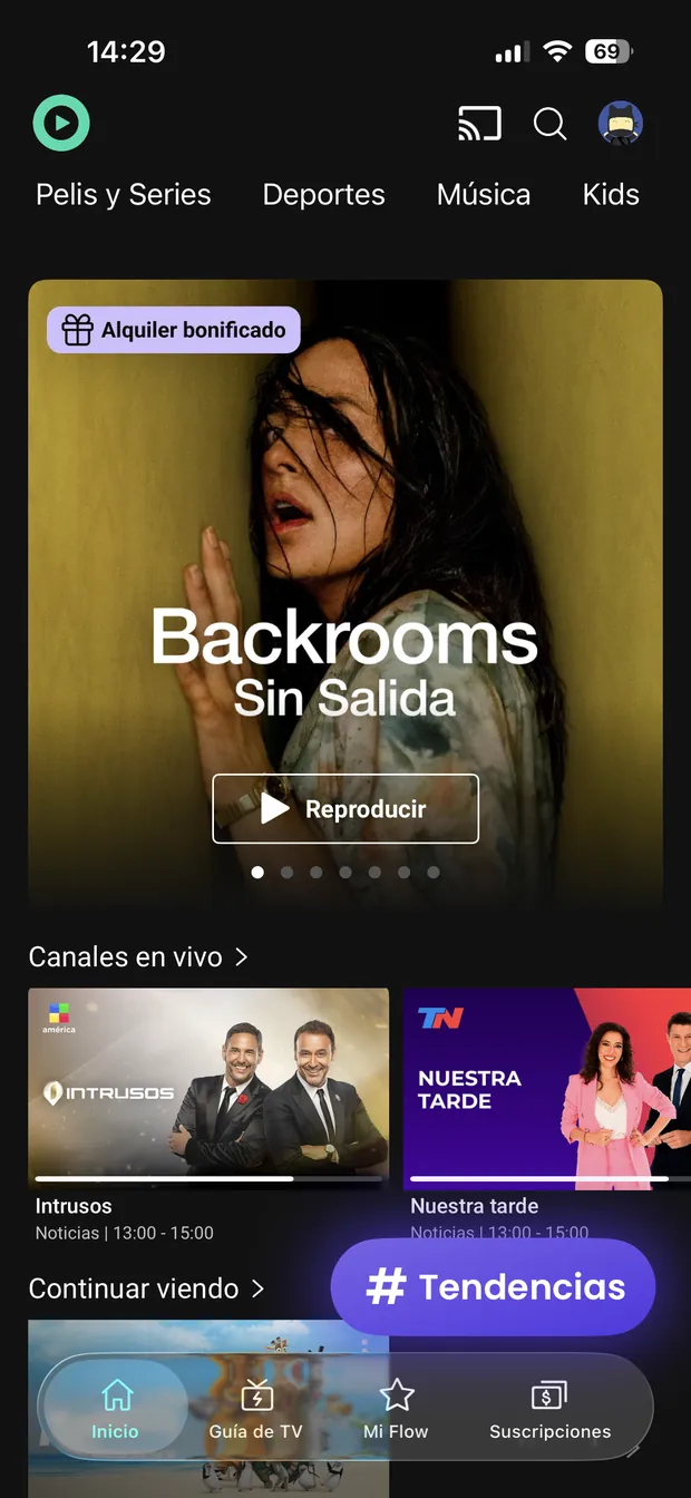
Three symptoms of that hierarchy: playback lacks prominence, live timing is hard to recognize, and an overlay competes with content already started.
010203
Home · audited version
01
A secondary-looking primary action
The outlined Play button loses prominence against the artwork.
02
Timing is hard to scan
Live-program times sit in small text below the cards.
03
An overlay competes with content
The floating Trends button covers part of Continue watching.
Usage situations
Two entry intentions that call for opposite things.
Two fictional personas created for the exercise. They represent entry intentions, not validated user segments.
Low urgency
“I want to watch something, but I don’t know what.”
Help me choose
He opens the app without a title in mind and browses, hoping something will catch his attention. The more he searches, the harder it becomes to decide.
Needs
Fewer, better-explained options.
Germán · 38
High urgency
“It’s already started and I’m missing it.”
Help me get there
She opens the app when something has a scheduled time. She is not there to explore: she needs to know in seconds whether it is available, whether it is live, and how to access it.
Needs
Visible timing and a direct way in.
Sofía · 29
Designing only for Germán sidelines live content; only for Sofía turns the home into a TV guide. The real problem is supporting both without one taking over.
The proposal
One proposal dominates. But not always the same one.
One dominant recommendation makes priority visible, but concentrates the risk of getting it wrong. That is why other options remain accessible below.
I started with the first opportunity to play. Giving several alternatives equal weight, as in a carousel, cancels out priority. The proposal chooses one featured item according to the available signal:
Relevant live event
There is a relevant live event about to start
Live takes priority. Its value depends on the moment — there is nothing to postpone.
Continuity
There is an unfinished session
What was started takes priority. The choice has already been made; all that remains is to resume.
Popularity
No live event qualifies and there is no session to resume
Most watched takes priority, with the recommendation reason visible. It is an aggregate signal, not a personal preference.
The rule
Live content must pass two gates.
There is almost always something live on Flow: its existence alone does not justify permanent priority. To take the featured spot, it must therefore meet two conditions: proximity and relevance.
Gate 01
Proximity
when
The event is about to start or has just started. If it is still a long way off, it is not a decision yet.
Gate 02
Relevance
for whom
It belongs to a competition or channel that profile has already watched. An event’s existence alone does not make it relevant.
The tie-breaker
What if they tie?
live + unfinished session
Live content wins, and “Continue watching” becomes the first row of the scroll. What loses priority is not lost.
From structure to interface
One structure. Three signals.
The layout keeps its height and structure. What changes is the featured content, its action and the first row below.
A · Unfinished sessionB · Live eventC · No viewing history
The system
Order by how much is left before play.
Each block is ordered by how much the person must decide before playing: what is urgent, already chosen, still to discover, or needs comparison. The proposal does not invent new rows: it defines how to prioritize existing ones using available signals.
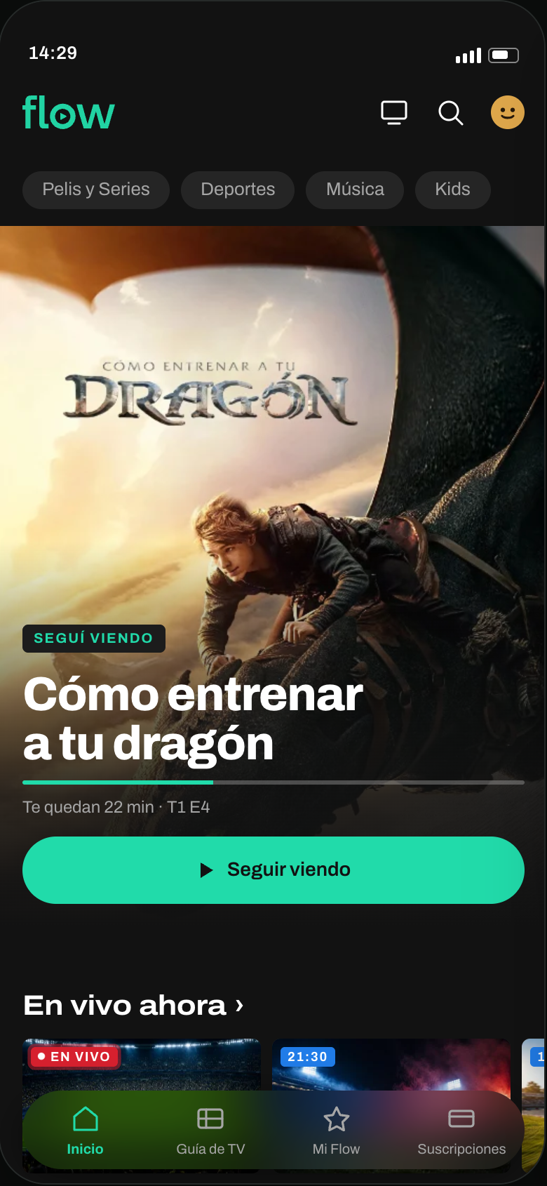
A · Unfinished session
Continuity
Cómo entrenar a tu dragón, 22 minutes remaining
Immediacy
Live now
16:9
Trending
16:9
Continuity
Continue watching
16:9
Discovery
Because you watched Cómo entrenar a tu dragón
2:3
Most watched on Flow today
2:3
This week’s releases
2:3
Exploration
Subscriptions that enhance your experience
block
Discounted rentals
2:3
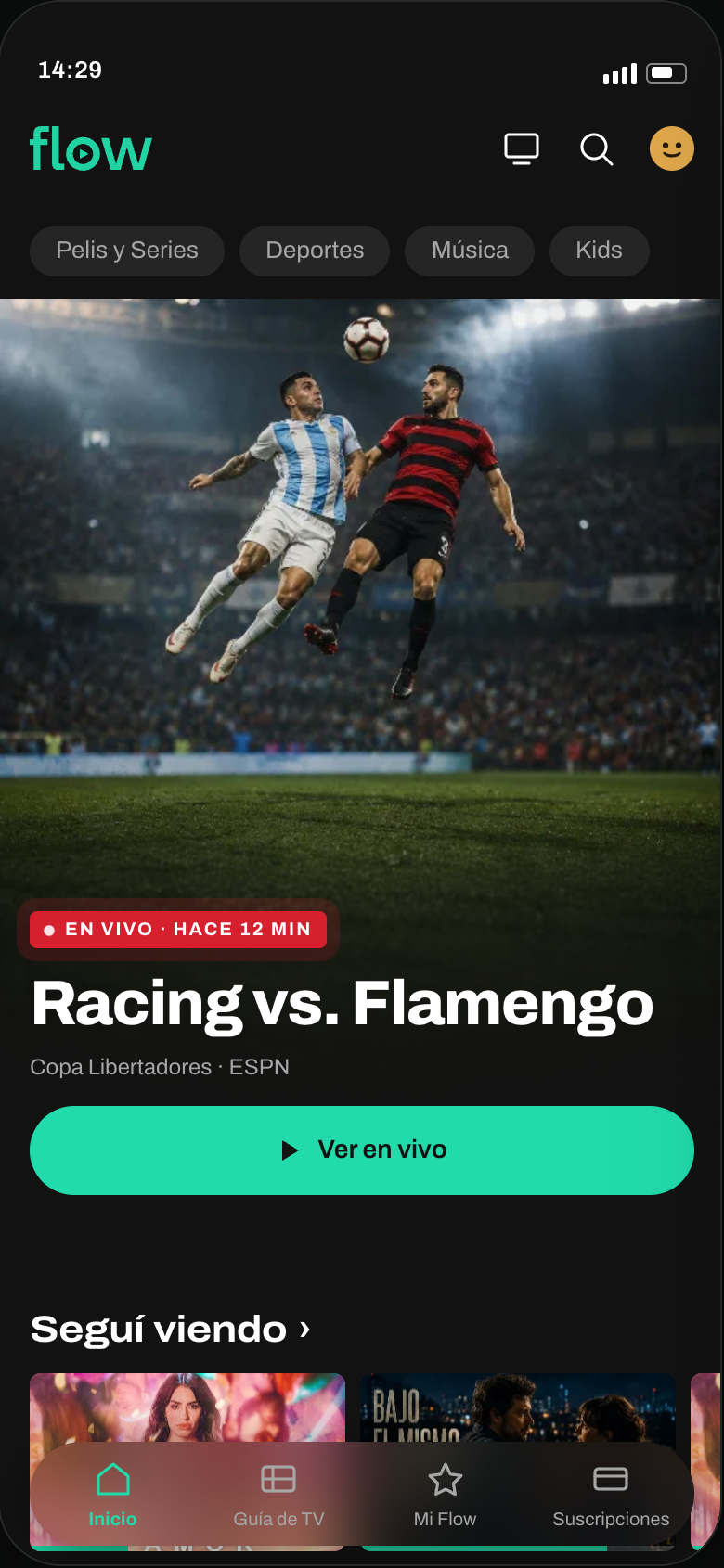
B · Live event
Immediacy
Racing vs. Flamengo, live
Continuity
Continue watching
16:9
Immediacy
Live now
16:9
Trending
16:9
Discovery
Because you watched Cómo entrenar a tu dragón
2:3
Most watched on Flow today
2:3
This week’s releases
2:3
Exploration
Subscriptions that enhance your experience
block
Discounted rentals
2:3
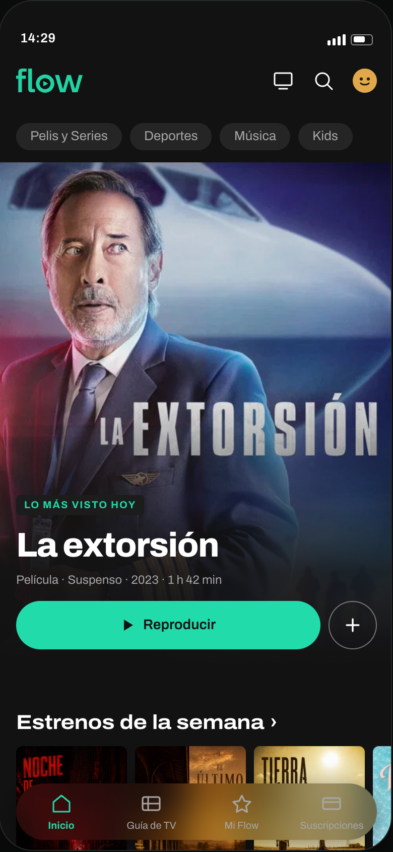
C · No viewing history
Popularity
La extorsión, most watched today
Discovery
This week’s releases
2:3
Most watched on Flow today
2:3
Immediacy
Trending
16:9
Live now
16:9
Exploration
Subscriptions that enhance your experience
block
Discounted rentals
2:3
Cannot be built in this state
Continue watching
No session started
Because you watched…
No viewing history
The prototype
Explore how the home changes.
The strongest available signal determines what appears first. Change the state to see the featured content and rows respond.
Scroll inside the screen to explore the home.
Visual design and states
A component is not just its shape: it is also how it responds.
One primary action. Text and color distinguish what is live from what is coming up. Visible feedback when saving: small details support the hierarchy too.
Format and state
Content titleLive and continuityOn-demand catalog
Category pill
Idle · pressed · selected
Primary action
One per screen · variants
Secondary action
No visible label · confirms its state
Chip family
One shape, four meanings
Continue watchingLive21:30$1.990
Action and progress
Live now
Coming up
Expected improvement
Less comparison for Germán, less searching for Sofía.
The problem was deciding, not a lack of visual stimulation. The proposal aims to make that choice easier based on context. I would validate it by comparing both homes in a controlled experiment, aiming to generate more plays, not just move them between rows.
↘
Decide sooner
Less effort to find something to watch.
I would measure
Time to first play + scroll depth before playback.
▶
Start watching
A clear recommendation that leads to playback.
I would measure
Playback rate from the featured area. I would also examine early exits or content switches after play as signals to investigate.