 Before
The tension
Push too hard, you break trust. Push too soft, nobody adopts.
Mercado Pago needed visibility without overpowering the providers users already trusted.
Prioritizing it too aggressively could hurt trust and conversion. Underexposing it would limit adoption.
The challenge wasn't visual hierarchy alone — it was defining how a new financial product enters an ecosystem of familiar behaviors.
In remittances, familiarity often matters more than efficiency.
The strategic bet
Three principles that shaped every design decision.
Exploration
Pressure-testing the bet.
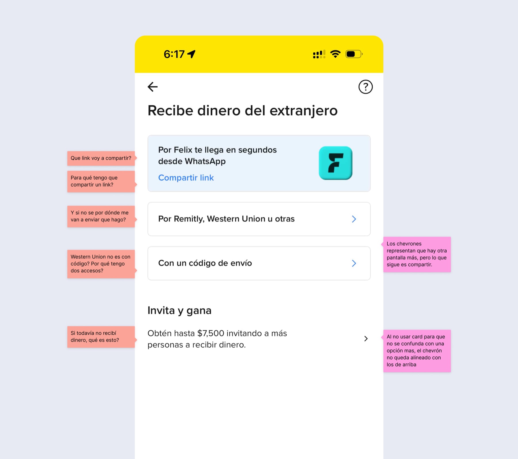
Multiple explorations tested visibility, provider hierarchy and coexistence patterns.
Most weren't shipped, but they defined the limits of the final experience.
We also cut an Activities section that duplicated the home screen — less noise, more focus on the one action that mattered.
How the strategy played out
From strategy to surface.
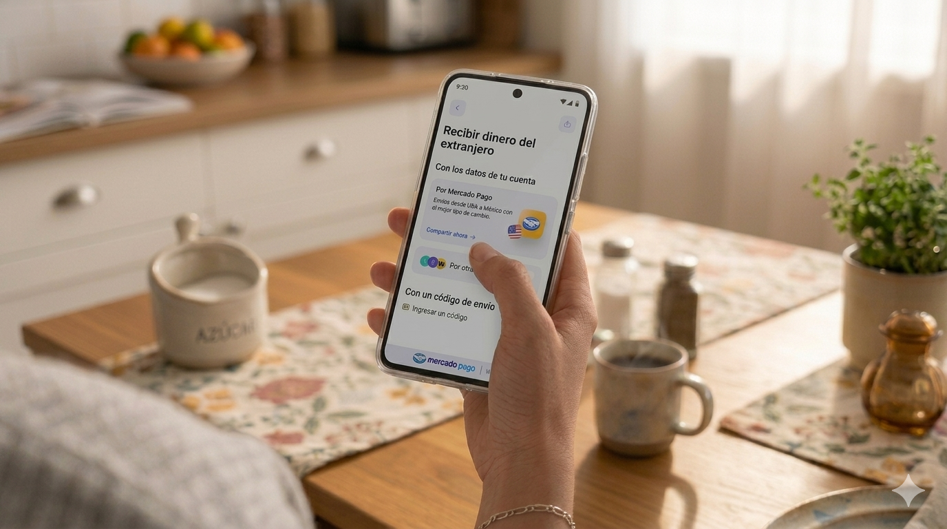
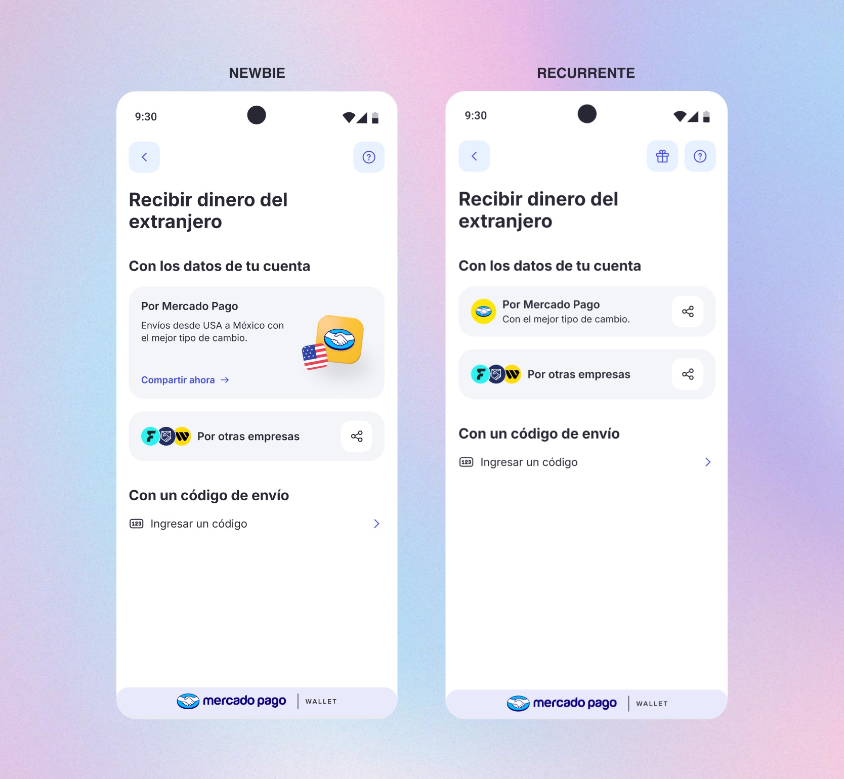
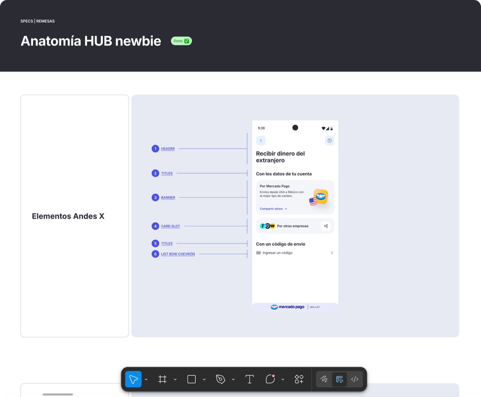
The hub
A hub that adapts to user maturity.
For new users, a prominent Mercado Pago banner highlights its value proposition while keeping every other provider one tap away.
Once a user completes their first remittance, the experience compresses: the banner becomes a smaller card and the focus shifts from education to speed.
Trust in context
Trust at the riskiest step: sharing data.
Research showed users avoided sharing account data because they didn't know exactly what would be sent.
I redesigned the interaction to make the shared data explicit — guiding users through it, surfacing exactly what was about to leave their phone, and letting them send it with confidence.
Critical entry points
Brought into the system.
Many users entered the experience through a code provided by the sender — and nearly half of those codes failed validation, often because users didn't know which providers were supported.
We simplified the copy, surfaced supported provider logos and added inline validation for 8- and 10-character codes. The number of failed entries dropped sharply.
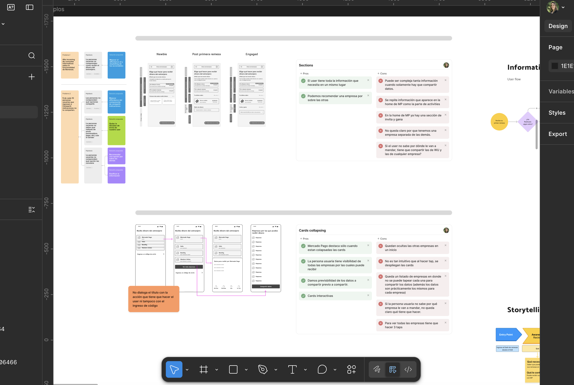
The architecture in full
A hub-based flow, unified across providers.
The diagram below maps the happy path — the optimal journey a user follows to receive a remittance successfully, from entry to confirmation. Edge cases and error states are documented separately.
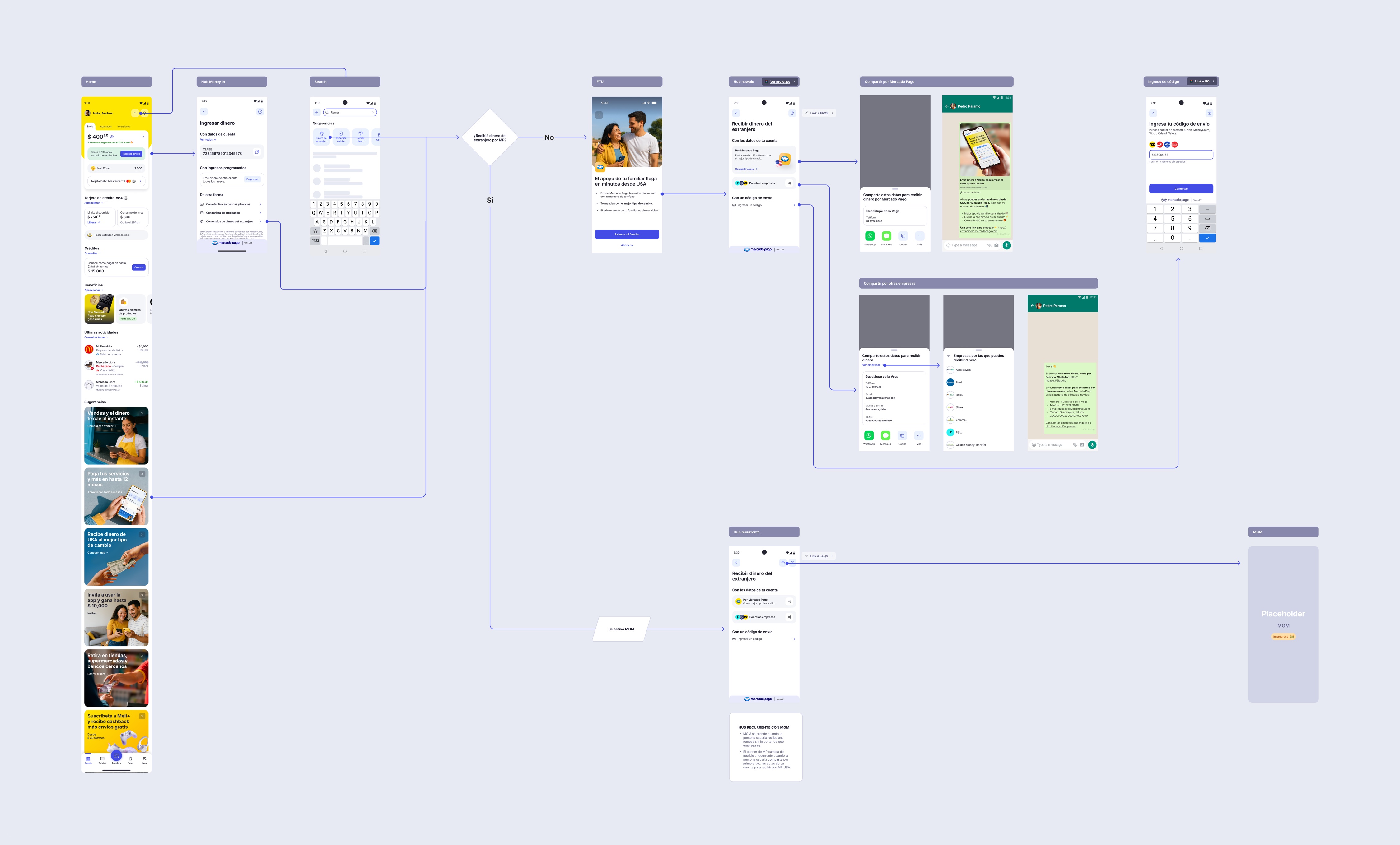 User flow — Tap to zoom · drag to explore
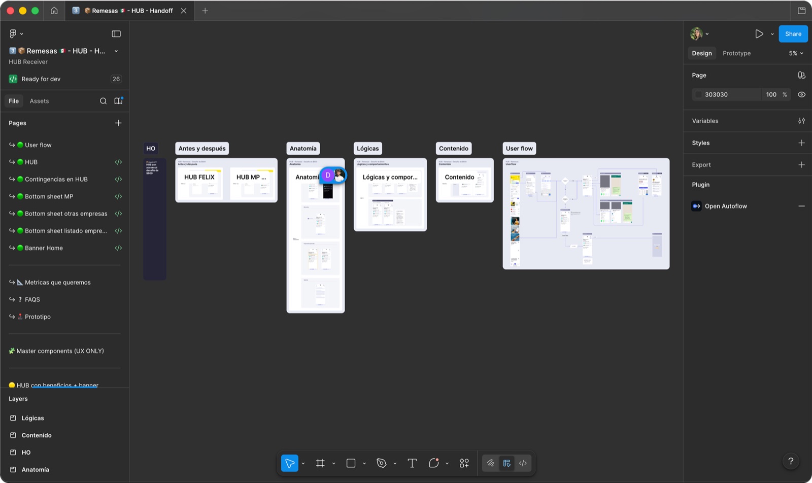
Handoff
Built for autonomous implementation.
I structured the handoff so IT could implement autonomously: documented flows, every interactive moment, edge cases and component anatomy.
It kept the system maintainable as new providers and markets entered the experience.
Impact
Growth without eroding trust.
Less is more — but sometimes you need a little more to earn trust first. The system showed that a new product can gain traction without displacing what users already rely on.